

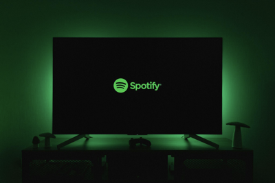

Spotify has given its app icon a temporary makeover to mark its 20th anniversary, replacing the familiar green circle with a sparkly green disco ball. The company is pairing the change with a campaign called “Spotify 20: Your Party of the Year(s),” and users can find anniversary features inside the mobile app, according to USA Today.
The new icon keeps the three curved black soundwave lines from the original design, but adds a 3-D look that makes it resemble a mirror ball. Spotify has said the update is meant to signal a special moment for the brand, which it has used to celebrate other milestones before.
Subscribe to Chicago Star’s Weekly City Buzz Newsletter
User reaction and new features
Not everyone is happy with the change. According to The Independent, some users on social media said the redesign looked confusing, while others called for the old logo to come back right away. A few users, however, were more accepting and said the company could have made a much simpler change.
Spotify’s disco ball logo comes as the service rolls out other anniversary content. The company recently shared its all-time most-listened-to artists, albums, songs, podcasts, and audiobooks, per USA Today. It also launched a personalized listening history feature called “Your Party of the Year(s).”
Read more on Chicago Star
40th annual Scottish Festival & Highland Games to feature bagpipes, World Cup watch party
The Flip: Chicago’s Playable Pinball Museum gets a glow-up with move from Pilsen to the Loop
A cinerous vulture chick hatches for the first time in 13 years at Lincoln Park Zoo
Ready, set, race! Brookfield Zoo Chicago to host Dino Dash Fun Run this spring
That feature gives mobile users a look at personal streaming milestones, including their first day on Spotify, top artists, and most-played songs, said USA Today. Spotify said users can find it by searching “Spotify 20” or “Party of the Year(s)” in the app, or by visiting spotify.com/20 on a mobile device.
According to The Independent, Spotify has said the green color behind the brand has always been a deliberate choice meant to stand out from the more muted shades common in tech. The company’s leaders also said the logo’s look should feel vibrant, unexpected, and tied to the brand’s identity.


(0) comments
Welcome to the discussion.
Log In
Keep it Clean. Please avoid obscene, vulgar, lewd, racist or sexually-oriented language.
PLEASE TURN OFF YOUR CAPS LOCK.
Don't Threaten. Threats of harming another person will not be tolerated.
Be Truthful. Don't knowingly lie about anyone or anything.
Be Nice. No racism, sexism or any sort of -ism that is degrading to another person.
Be Proactive. Use the 'Report' link on each comment to let us know of abusive posts.
Share with Us. We'd love to hear eyewitness accounts, the history behind an article.